
Quick Answer: The best living room color ideas for 2026 are warm sage green, espresso brown, deep navy, dusty plaster pink, charcoal, muted teal, warm mushroom, aubergine, earthy terracotta, and soft powder blue. The right pick depends on your room’s light direction, your couch color, and your room size. This guide matches each color to exactly those factors, so you choose right the first time.
You have been staring at the same beige walls for three years. Or maybe you repainted in gray during the last big gray wave, and now it feels flat and lifeless. Or you love color but have absolutely no idea where to start without making a $300 mistake you have to live with for the next five years.
Here is the thing about living room color that most guides skip: the color does not just sit on the wall. It changes with the time of day, your lighting, the color of your couch and flooring, and your curtains. A color that looks gorgeous in a magazine photo can fall completely flat in your specific room, and you will not know why. Benjamin Moore’s online color tool lets you browse thousands of shades with room previews.
This guide fixes that. You get the 10 best living room color ideas for 2026, with specific paint names from brands you can actually buy at a store. You also get a practical framework for choosing the right color for your light, your furniture, and your room size before you commit to a single gallon.
Before painting any living room wall, it is worth making sure the surface is properly prepped. This guide on wall paint repair and fixing peeling and cracking paint walks through exactly how to get walls ready before any new color goes on, which makes a real difference in how the final result looks and how long it lasts.
How to Choose the Right Living Room Color Before You Pick Any Shade

Skip this section, and you will pick the wrong color. It happens to almost everyone who goes straight to browsing colors without thinking about their specific room first.
Consider Your Room’s Natural Light Direction
This is the single most important factor in living room color selection, and it is rarely mentioned in color roundup articles.
North-facing living rooms get cool, indirect light all day. Colors look cooler and darker in these rooms than they do on a paint chip or in a photo. Warm colors like terracotta, sage green, and warm mushroom perform much better in north-facing rooms because they counterbalance the cool light. Cool colors like blue and gray tend to look flat and gloomy.
South-facing living rooms get warm, bright light for most of the day. Almost any color works here. Cool blues and grays that would look depressing in a north-facing room look crisp and fresh with south light. Rich, saturated colors that might feel overwhelming elsewhere feel balanced and intentional with good southern light.
East-facing rooms get bright morning light that turns cool by afternoon. Colors look warm and inviting in the morning and cooler later in the day. Mid-tone colors that bridge warm and cool perform consistently best here.
West-facing rooms are the opposite. Cool in the morning and bathed in warm golden light in the afternoon and evening. Warm colors can become very intense in the evening in west-facing rooms. If you love a warm terracotta or deep espresso brown, test it carefully in a west-facing room before committing.
Match the Color to Your Couch First
Your couch is the largest piece of furniture in the room, and it is probably not moving. The wall color needs to work with your couch, not fight it.
This guide covers the specific color-to-couch matchups in a dedicated section below. Before you browse the ten colors, note your couch color and jump to that section to narrow your choices first. It will cut the list from ten options down to three or four that will genuinely work in your specific room.
Small Room vs Large Open Plan: Different Rules Apply
Dark, saturated colors make small rooms feel smaller. Light, warm neutrals, and soft colors make small rooms feel larger. That is the simple version.
The more nuanced version: in a small living room, a single dark accent wall can add drama without closing the room in, as long as the other three walls stay light. In a large open plan space, you have room to go darker across all four walls without the space feeling cramped. Color drenching, applying one shade to walls, ceiling, and trim together, works beautifully in larger spaces and feels oppressive in small ones.
10 Best Living Room Color Ideas for 2026

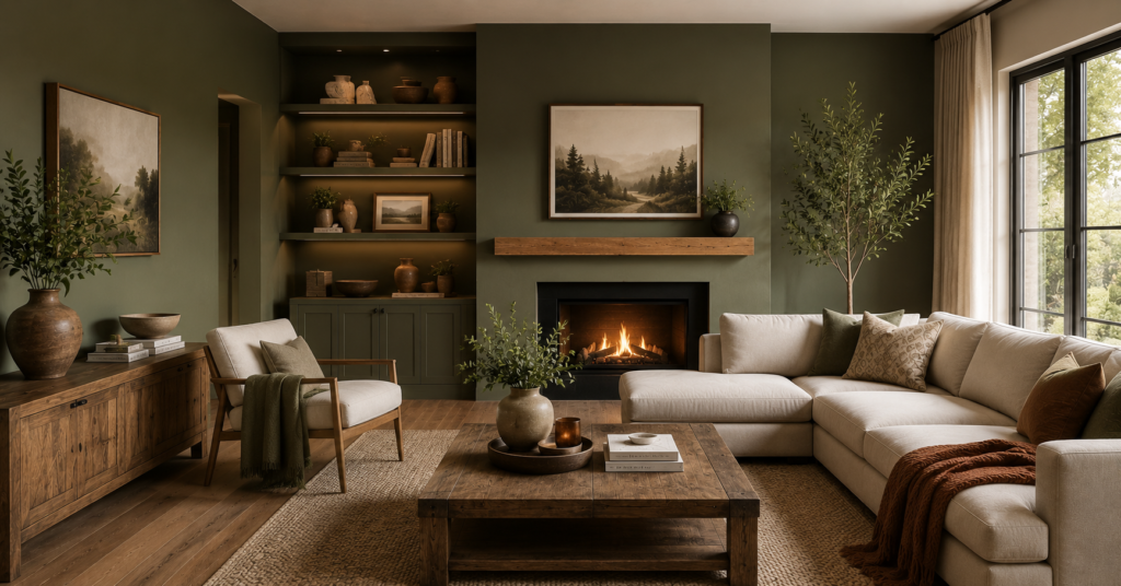
1. Warm Sage Green
Sage green is the color that keeps giving. It has been trending for two years and shows no sign of fading in 2026, and there is a good reason for that. It works in almost every home style, pairs with almost every furniture color, and brings a natural, organic warmth that neither white nor gray can replicate.
The 2026 version of sage green is moving slightly warmer and earthier than the cool sage that dominated earlier years. Valspar’s Color of the Year 2026 is Warm Eucalyptus, a warm sage-inspired green that captures exactly where the trend is heading. Benjamin Moore’s Saybrook Sage and Sherwin-Williams Rosemary are two other strong options that lean warm rather than cool.
Sage green works particularly well in living rooms that face north or east, where its warmth counterbalances the cooler light. It pairs beautifully with natural wood furniture, linen upholstery, terracotta accents, and brass hardware.
Best for: Farmhouse, transitional, craftsman, and Scandinavian-inspired living rooms. Pairs with: Natural wood, cream, warm white, terracotta, brass accents. Paint picks: Valspar Warm Eucalyptus, Benjamin Moore Saybrook Sage, Sherwin-Williams Rosemary.
2. Espresso Brown
Designers have been calling this one “espresso martini” in 2026, and the name captures its energy well. It is a deep, rich brown that feels both grounded and sophisticated without the coldness of charcoal or navy.
Espresso brown is having its moment because it fills a gap between the earthy neutrals that have been dominant and the bolder colors that are emerging. It reads as bold and intentional without being aggressive. In a room with good lighting, it creates a cozy, enveloping feeling that makes you want to sit down and stay.
It works best in living rooms with warm wood floors, natural fiber rugs, and upholstery in cream, camel, or warm white. Paired with brass or gold accents, it feels genuinely luxurious.
Best for: Traditional, mid-century modern, and warm contemporary living rooms. Pairs with: Cream, camel, warm white, gold, natural wood, terracotta. Paint picks: Benjamin Moore Chocolate Sundae, Sherwin-Williams Burnt Almond, Farrow and Ball Mahogany.
3. Deep Navy Blue
Navy is the color that delivers the highest wow factor in a living room, and in 2026, it is being embraced more broadly than ever before. Deep, almost-black blues create a cocoon-like effect that makes a living room feel intimate and intentional rather than just painted.
The key to making navy work is contrast. Navy walls need light elements to breathe against: cream upholstery, natural linen curtains, white trim, or warm wood furniture. Without contrast, navy can feel heavy. With it, it feels genuinely dramatic in the best sense.
Blue living room color ideas are among the most searched variations of this keyword, which tells you how much demand there is for this specific color family. Navy delivers a more sophisticated result than mid-tone blues and works across far more home styles.
Best for: Coastal, traditional, contemporary, and bold modern living rooms. Pairs with: Cream, white, brass, natural wood, warm neutrals. Paint picks: Benjamin Moore Hale Navy, Clare Goodnight Moon, Behr Starless Night.
4. Dusty Plaster Pink
Plaster pink is the color recommendation that surprises most people in 2026, and it consistently converts skeptics once they see it on the wall. It is not the bright pink you might be picturing. It is a muted, dusty, almost terracotta-inflected pink that functions more like a sophisticated warm neutral than a statement color.
Interior designer Marie Flanigan recommends Dead Salmon by Farrow and Ball specifically for this effect. Its soft blend of pink, brown, and earth tones adds warmth without overwhelming a space and pairs naturally with linen, wood, and stone.
Plaster pink works particularly well in living rooms that feel cold or unwelcoming because it adds warmth without the orange undertone of terracotta or the heaviness of brown.
Best for: Transitional, contemporary, and eclectic living rooms. Pairs with: Natural linen, warm wood, cream, sage green accents, and brass. Paint picks: Farrow and Ball Dead Salmon, Benjamin Moore Pale Blush, Sherwin-Williams Antique White with pink undertone.
5. Charcoal and Near Black
Charcoal is bold. It is also the color that most consistently delivers that high-end, architectural feeling that expensive interior design photographs are known for.
Sherwin-Williams Iron Ore is the most recommended charcoal for living rooms in 2026. The Sherwin-Williams ColorSnap Visualizer lets you upload a photo of your actual living room and test any of their colors on your specific walls, which removes most of the guesswork from the decision.
Its depth creates a sculptural quality in low light that lighter colors cannot touch. In natural light, it reveals subtle layers of warmth rather than reading as cold black. Used on all four walls in a living room with good natural light, it feels dramatic and confident without being oppressive.
Charcoal works best in south-facing living rooms with strong natural light. In a north-facing room, it can feel very heavy. Pair it with light upholstery, warm metals, and plenty of lighting to keep the room feeling alive.
Best for: Modern, contemporary, industrial, and luxury-leaning living rooms. Pairs with: Cream, warm white, brass, copper, natural wood, light gray. Paint picks: Sherwin-Williams Iron Ore, Benjamin Moore Wrought Iron, Farrow and Ball Railings.
6. Muted Teal
Teal bridges the gap between blue and green, and in its muted 2026 form, it delivers the freshness of both without the aggression of either. Interior designer Michelle Gage describes Benjamin Moore Atmospheric as her top recommendation for a teal living room, muted enough to feel livable and versatile enough to layer almost any other color on top of it.
Muted teal works as a full room color in a way that brighter teals do not. It reads as serene and sophisticated rather than bold and trendy, which means it will not feel dated in two years.
Best for: Coastal, Scandinavian, transitional, and relaxed contemporary living rooms. Pairs with: Warm caramel, emerald green accents, pink, warm white, and natural rattan. Paint picks: Benjamin Moore Atmospheric, Farrow and Ball Dix Blue, Sherwin-Williams Tidewater.
7. Warm Mushroom and Greige
Warm mushroom is what replaces gray in 2026. Designer Alice Moszczynski puts it well: shades like mushroom or putty feel grounded and offer the same versatility as gray but with a lot more soul.
If you loved the neutrality of gray but found it too cold and lifeless, warm mushroom is your color. It reads differently in every light, slightly pink in warm light and slightly green in cool light, which makes it one of the most adaptable colors available. It works with almost every furniture color and suits almost every room orientation.
Best for: All home styles. Particularly strong in traditional and transitional living rooms. Pairs with: Almost everything. Particularly strong with cream, sage green, navy, and warm wood. Paint picks: Farrow and Ball Elephant’s Breath, Sherwin-Williams Accessible Beige, Benjamin Moore Pale Oak.
8. Aubergine and Dusky Purple
Purple is back in 2026, and it is not the purple you remember from the 1990s. Aubergine, specifically, a deep wine-dark purple with red and brown undertones, is what designers are reaching for. It creates a genuinely luxurious feeling that is hard to achieve with any other color.
It works best as a bold all-room color in smaller living rooms where its richness feels appropriate to the scale, or as a single statement wall in a larger space where you want one focal point. Pair it with natural textures like woven chairs, chunky textiles, and warm wood to stop it from feeling overly formal.
Best for: Eclectic, maximalist, traditional, and bold contemporary living rooms. Pairs with: Warm gold, cream, natural wood, terracotta, forest green. Paint picks: Farrow and Ball Preference Red (leans purple), Benjamin Moore Bewitched, Sherwin-Williams Grape Harvest.
9. Earthy Terracotta
Terracotta is the warmest color on this list, and it earns its place by doing something no other color can: it brings the feeling of warm afternoon sun into a room regardless of which direction the room faces.
In 2026, the terracotta being used is less orange and more brown-red, leaning toward the dusty clay tones of Mexican and Mediterranean architecture rather than the bright orange-red terracotta of the 2010s. This more muted version is easier to live with and ages much better on the walls.
Terracotta works particularly well in north-facing rooms where the warmth of the color compensates for the cooler light. It also pairs beautifully with the checkerboard floor trend that is currently very popular in US homes. If you are thinking about flooring alongside your wall color, this guide on stunning checkerboard floor ideas shows exactly how to combine bold flooring with wall color effectively.
Best for: Mediterranean, bohemian, farmhouse, and warm eclectic living rooms. Pairs with: Cream, sage green, warm white, natural rattan, warm wood, terracotta tile. Paint picks: Benjamin Moore Tuscan Tan, Sherwin-Williams Cavern Clay, Farrow and Ball Red Earth.
10. Soft Powder Blue
Pale powder blue is replacing neutral whites and light grays as the fresh, airy backdrop for living rooms in 2026. It is light enough to keep a room feeling open and bright, but brings just enough color to make the space feel considered and intentional rather than safe and generic.
Powder blue works exceptionally well in south-facing rooms where its coolness is balanced by strong warm light. In east or west-facing rooms, check it in both morning and afternoon light before committing. In north-facing rooms, add extra warm lighting to stop it from pulling too cool.
Best for: Coastal, Scandinavian, transitional, and light contemporary living rooms. Pairs with: Warm white, navy, coral, natural linen, light wood, brass. Paint picks: Farrow and Ball Borrowed Light, Benjamin Moore Breath of Fresh Air, Sherwin-Williams Iceberg.
Living Room Color Ideas by Couch Color

Color Ideas With a Brown or Tan Couch
Brown couches are warm and versatile. They pair beautifully with sage green walls, which add freshness without clashing. Warm mushroom and greige work well too, tonal harmonies that feel luxurious. Deep navy is a strong contrast choice that makes brown leather in particular look expensive. Avoid cool grays, which drain the warmth from brown upholstery and make it look dull.
Best wall colors: Sage green, warm mushroom, deep navy, terracotta, and espresso brown accent wall.
Color Ideas With a Gray Couch
Gray couches are the most versatile starting point. Almost every color on this list works with gray, but the best performers are soft powder blue for a fresh coastal feel, warm sage green for an organic look, and charcoal for a sophisticated tonal approach. Avoid pure cool whites with gray couches in north-facing rooms, as both will feel cold together.
Best wall colors: Soft powder blue, warm sage green, charcoal, muted teal, warm mushroom.
Color Ideas With a Blue or Navy Couch
A blue couch needs wall colors that do not compete. Warm mushroom and greige are the safest and most effective choices, giving the blue sofa room to be the focal point. Soft white or warm cream also works beautifully. Avoid navy walls with a navy couch unless you are deliberately going for a full color-drenched look with intentional tonal variation.
Best wall colors: Warm mushroom, cream, soft white, terracotta, warm sage green.
Color Ideas With a White or Cream Couch
White and cream couches are the most flexible pairing point in any living room. They work with every color on this list. For maximum impact, go bold with navy, charcoal, or aubergine on the walls. For a softer look, sage green or plaster pink against a cream couch creates a layered, magazine-ready result.
Best wall colors: Any of the 10 colors above. Bold choices like navy and charcoal are particularly stunning.
Colors Going Out of Style in 2026 and What Replaces Them
This section matters because choosing a color that is already on its way out means your living room will feel dated before you even finish the second coat.
Cool gray is fading fast. The all-gray living room that was everywhere from 2015 to 2023 now reads as flat and generic. Warm mushroom, greige, and plaster pink are the replacements that offer the same neutrality with far more warmth and character.
Stark bright white is losing ground. Pure white living rooms feel sterile and clinical in 2026. Warm whites with cream and ivory undertones are replacing them, as are soft powder blues and warm mushrooms for people who want something with a little more presence.
Sage green is evolving, not disappearing. The cool, mint-adjacent sage of recent years is being replaced by warmer, earthier sage tones. If your sage green walls feel slightly dated, the fix is not replacing the color but warming the undertone.
Bright, saturated colors are pulling back. Electric blue, vivid yellow, and highly saturated statement colors are giving way to more nuanced, muted versions of those same color families. Deep navy replaces electric blue. Warm sage replaces vivid green. Dusky plaster pink replaces bright coral.
For guidance on specific paint names and how to visualize colors in your actual room before painting,
Best Living Room Colors for Small Rooms

Small living rooms have different needs from large open plan spaces. These rules apply specifically to rooms under 200 square feet:
Go light on at least three walls. One dark or bold accent wall is fine and adds drama without closing in the space. Four dark walls in a small room will feel oppressive regardless of how beautiful the color is.
Warm light colors work better than cool light colors in small rooms. Warm whites, soft sage green, and plaster pink make small rooms feel larger and more inviting than cool whites and pale grays, which can feel clinical and small.
Match your ceiling to your walls for a color-drenched effect. In a small room, carrying the wall color onto the ceiling removes the hard horizontal line at the top of the room and actually makes the space feel taller.
Use color to define zones in open plan small spaces. If your living room flows directly into a dining or kitchen area, use the same color throughout to create a sense of cohesion, rather than using different colors in each zone, which can visually shrink both areas.
For additional ideas on making small living spaces feel larger through furniture arrangement and layout choices, this guide on compact furniture ideas for small rooms covers practical space-saving approaches that work alongside your color choices.
Frequently Asked Questions
Q: What is the most popular living room color in 2026?
A: Warm sage green is the most consistently recommended living room color across designer surveys and paint brand reports in 2026. Valspar’s Color of the Year 2026 is Warm Eucalyptus, a warm sage-inspired green that captures exactly where the trend is heading. Espresso brown and deep navy are the two strongest alternatives for homeowners who want something bolder.
Q: What living room colors make a room look bigger?
A: Light, warm colors make living rooms look bigger. Soft powder blue, warm mushroom, plaster pink, and warm white all create a sense of space. Using the same color on walls and ceiling amplifies this effect. Avoid dark colors on all four walls in small rooms, but consider one dark accent wall to add drama without shrinking the space.
Q: What wall color goes with a brown couch?
A: Sage green is the most popular and successful wall color with a brown couch in 2026. Deep navy is a bold contrast that makes brown leather look particularly expensive. Warm mushroom creates a tonal, layered look. Avoid cool grays, which drain the warmth from brown upholstery and make both elements look flat.
Q: Are gray living rooms out of style in 2026?
A: Cool gray is fading significantly in 2026. Pure cool grays feel flat and dated compared to the warmer, more nuanced tones that are taking their place. Warm mushroom, greige, and plaster pink offer the same versatility as gray but with far more warmth and character. If you currently have cool gray walls, warming the undertone with new paint is one of the most cost-effective updates you can make.
Q: Should living room walls be lighter or darker than the furniture?
A: Generally, walls slightly lighter than your main furniture piece give the most balanced and timeless result. Dark walls with light furniture are the bold, dramatic option that works very well in rooms with good natural light. Light walls with dark furniture are the safe, versatile option that works in almost any room. Matching walls and furniture in the same tone, color drenching, is the current designer-favorite approach for a confident, intentional look.
Have a specific couch color or room situation you are not sure about? Drop your details in the comments, and we will suggest the right color combination for your specific setup.

Samreen Khadim Hussain is a home improvement writer and content creator at Domelite Home. She specializes in making home renovation, interior design, and bathroom safety accessible to everyday US homeowners, turning technical subjects into clear, actionable advice. Her work is rooted in research, real-world practicality, and a genuine belief that a better home is within everyone’s reach.
