Quick Answer: A dark academia color palette combines forest green, burgundy, chocolate brown, espresso, charcoal, navy, and antique gold with softer shades such as cream and parchment. These colors create a scholarly, vintage-inspired atmosphere. For a balanced room, choose one dominant dark color, add one or two complementary shades, and use lighter neutrals to prevent the space from feeling too heavy.
A dark academia room should feel like a quiet old library filled with books, rich wood, vintage furniture, and warm light. Color is what brings that atmosphere together.
The good news? You don’t need dark walls in every room or expensive antique furniture to achieve the look. A carefully chosen palette can work with existing sofas, bedroom furniture, rugs, and accessories.
Here are 12 colors to consider, along with practical combinations and ways to use them throughout your home.
What Colors Define the Dark Academia Aesthetic?
Dark academia draws inspiration from historic libraries, traditional studies, classical art, and old-world interiors. Its colors tend to be deep, earthy, and slightly muted, not bright or glossy.
Popular choices include forest green, burgundy, chocolate brown, charcoal, navy, and aged cream. Antique gold adds warmth, while lighter neutrals provide contrast.
Better Homes & Gardens also highlights combinations of burgundy, forest green, charcoal, navy, earthy neutrals, and aged brass in dark academia interiors. Explore its dark academia decorating guide.
12 Best Dark Academia Colors for Your Home

The HEX codes below are useful starting points for mood boards and digital planning. Actual paint colors can look different depending on lighting, finish, and surrounding materials, so test physical samples before buying paint.
1. Forest Green — #2F4A3A
Forest green is a classic dark academia color because it evokes ivy-covered buildings, old libraries, and traditional study rooms.
Use it on an accent wall, built-in bookcase, or velvet armchair. Pair it with walnut furniture, cream textiles, and antique brass details.
2. Burgundy — #7A2E3A
Burgundy adds richness without relying on black.
It works well in bedrooms, living rooms, and reading corners. Try burgundy curtains, a velvet chair, or a painted feature wall against dark wooden furniture.
For balance, add cream or warm beige rather than introducing several other bold colors.
3. Chocolate Brown — #3B2A1E
Chocolate brown creates the warm, bookish foundation of the aesthetic.
Use it through wooden furniture, leather seating, flooring, or wall paint. It pairs naturally with forest green, burgundy, parchment, and muted gold.
If your room already has dark wood furniture, repeat the brown in smaller details instead of adding another large dark surface.
4. Espresso — #4A3428
Espresso is deeper than many traditional browns and can create a dramatic, intimate atmosphere.
Consider it for cabinetry, doors, bookshelves, or a study accent wall. It works best when balanced with visible wood grain, warm lighting, and lighter textiles.
5. Charcoal — #383838
Charcoal offers a modern alternative to pure black while maintaining the moody appearance associated with dark academia.
Use it on walls, picture frames, or upholstered furniture. Combine it with burgundy, aged cream, dark wood, or muted brass.
In a small or poorly lit room, use charcoal selectively rather than covering every surface.
6. Midnight Navy — #202B45
Midnight navy brings depth without making the palette entirely brown or green.
It works especially well in studies, bedrooms, and living rooms. Pair it with cognac leather, walnut furniture, ivory fabrics, and antique-gold accents.
7. Antique Gold — #B08D57
Antique gold adds warmth and highlights details without overwhelming darker colors.
Use it for lamp bases, picture frames, drawer handles, mirrors, and small decorative objects. Aged or muted finishes usually suit the aesthetic better than bright, highly polished gold.
8. Olive Green — #5E6B4E
Olive green is a softer option for anyone who wants dark academia style without very deep walls.
Try olive paint, curtains, cushions, or upholstered seating. It pairs well with chocolate brown, cream, burgundy, and aged brass.
9. Warm Taupe — #8A7968
Warm taupe helps balance darker colors while preserving a traditional atmosphere.
Use it on walls, rugs, curtains, or larger furniture pieces. It is particularly useful in rooms where natural light is limited and an all-dark palette might feel overwhelming.
10. Rust — #9A4F32
Rust introduces an earthy, autumn-inspired accent.
Use it in throw pillows, patterned rugs, artwork, or a small upholstered chair. Pair it with forest green, chocolate brown, and cream for a warm, collected look.
11. Parchment Cream — #E6DCC3
Parchment cream recalls aged paper, old book pages, and traditional library interiors.
It provides contrast against dark walls and furniture. Use it for bedding, curtains, lampshades, artwork backgrounds, or painted trim.
This shade is especially useful if you want the dark academia aesthetic without creating an overly dim room.
12. Muted Plum — #554052
Muted plum offers a subtle alternative to burgundy for readers who prefer a more unusual color combination.
Use it on a reading chair, curtains, accent wall, or decorative textiles. Pair it with charcoal, warm taupe, dark wood, and cream.
5 Dark Academia Color Combinations That Work
| Color combination | Best room | Overall effect |
| Forest green + walnut + cream | Study | Traditional and scholarly |
| Burgundy + charcoal + parchment | Bedroom | Rich and dramatic |
| Midnight navy + antique gold + ivory | Living room | Elegant and balanced |
| Chocolate brown + olive green + taupe | Reading nook | Warm and earthy |
| Muted plum + espresso + cream | Bedroom or lounge | Moody and distinctive |
You don’t need to use every color in the same room. Choose one combination and repeat its shades in a few places to keep the room feeling connected.
How to Build a Dark Academia Color Palette
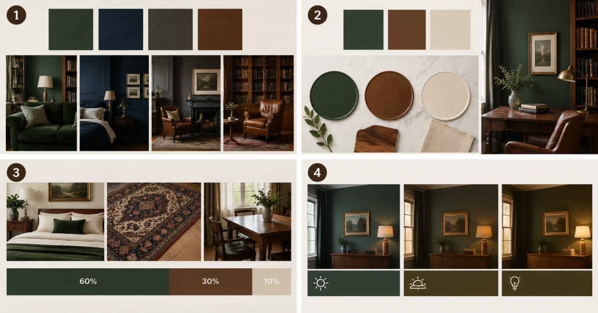
Start With One Main Color
Choose the shade that will define the room. Forest green, navy, charcoal, and chocolate brown are useful starting points.
If you’re unsure about painting the walls, start by introducing the main color through a rug, curtains, sofa, or bookshelf.
Add Two Supporting Colors
Select one complementary shade and one neutral. For example, pair forest green with walnut brown and parchment cream.
For help understanding complementary, analogous, and monochromatic schemes, see Sherwin-Williams’ guide to creating a successful color palette.
Balance Dark and Light Surfaces
Dark academia does not require every surface to be dark. Cream bedding, lighter rugs, natural wood grain, and daylight can help a room feel comfortable.
A practical starting point is the 60-30-10 approach: use one color for roughly 60% of the visual scheme, a second for 30%, and an accent for 10%. Treat this as a flexible guideline rather than a strict rule.
Consider Lighting Before Choosing Paint
A color can appear different in morning daylight, evening light, and under warm or cool bulbs.
Test paint samples on more than one wall and observe them at different times of day. This is particularly important for navy, charcoal, and deep green.
Dark Academia Color Palettes for Different Rooms
Bedroom
Use burgundy, forest green, or midnight navy as the main color. Balance it with cream bedding and wooden furniture.
For more decorating inspiration, explore our dark academia room guide.
Living Room
Combine chocolate brown, olive green, and parchment cream. A brown leather sofa, green accent chair, and cream rug can establish the palette without painting the walls.
If you prefer patterned walls, see our dark academia wallpaper ideas.
Home Office or Study
Forest green, espresso, and antique gold create a traditional study atmosphere. Use the darker colors on shelves or an accent wall, then add task lighting and a lighter desk accessory or rug.
For matching furniture choices, browse our dark academia furniture ideas.
Common Dark Academia Color Palette Mistakes
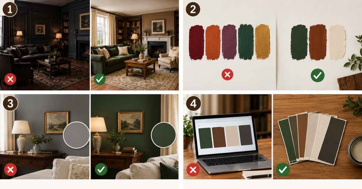
Using too many dark colors: Combining charcoal walls, dark flooring, and heavy furniture can make a room feel closed in. Introduce cream, taupe, or natural wood.
Mixing too many accent shades: Burgundy, rust, plum, green, and gold can compete if all are used in large amounts. Choose one main accent and keep the others subtle.
Ignoring undertones: A cool gray may clash with warm wood and cream textiles. Check colors together under your room’s actual lighting.
Choosing paint from a screen: HEX codes are helpful for planning, but they are not exact substitutes for physical paint samples.
Conclusion
A successful dark academia color palette balances deep, scholarly shades with warm materials and lighter accents. Forest green, burgundy, chocolate brown, charcoal, and navy create the foundation, while parchment cream, taupe, and antique gold keep the look layered and inviting.
Start with one dominant color, test it in your room’s lighting, and build around furniture and finishes you already own. A few coordinated choices can create a timeless, bookish atmosphere without a complete renovation.
Frequently Asked Questions
1. What is the main color of dark academia?
There is no single official color. Forest green, chocolate brown, burgundy, charcoal, and deep navy are among the most recognizable shades associated with dark academia interiors.
2. What colors go together in a dark academia palette?
Forest green and walnut, burgundy and charcoal, and navy with ivory and antique gold are useful combinations. Add cream or taupe to balance the darker shades.
3. Can I use a dark academia palette in a small room?
Yes. Use one dark accent color and balance it with lighter textiles, mirrors, and adequate lighting. You can also introduce the palette through furniture and accessories instead of painting every wall.
4. What is the best neutral color for dark academia?
Parchment cream, warm taupe, and muted beige are useful neutrals. They soften dark colors while maintaining the traditional, vintage-inspired atmosphere.
5. How do I create a dark academia color palette on a budget?
Start with existing furniture, then add affordable accents such as cushions, secondhand frames, curtains, or a small painted area. Test paint samples before committing to a full room.

I’m Samreen Khadim Hussain, a home improvement writer specializing in practical, research-driven content for U.S. homeowners. At Domelite Home, I cover home renovation, interior design, home maintenance, and residential safety, translating technical information and industry research into clear, actionable guidance. My approach combines search intent research, reliable sources, and reader-focused writing to help homeowners understand their options, make informed decisions, and create safer, more functional living spaces.